What is Waterfall Chart?
Wikipedia says “a waterfall chart is a form of data visualization that helps in understanding the cumulative effect of sequentially introduced positive or negative values”. It shows a running total as values are added or subtracted.
In this article, we will show how to create two types of waterfall chart - a simple one and a stacked one.
Creating Simple Waterfall Chart in Matplotlib
Consider the following table:
| Particulars | Company A |
|---|---|
| Revenue | 15203 |
| Cost of Goods | -4220 |
| Employee Expenses | -1002 |
| Income from Interest | 52 |
| Loan Payment | -13 |
| Net Income | 10020 |
For simplicity, we only have 1 column in this table.
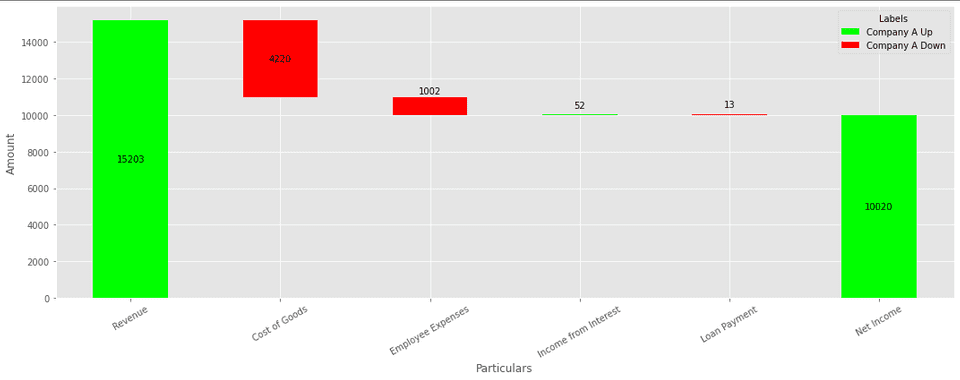
The waterfall chart for this table would be:
Code
First, let’s import the necessary dependencies:
import pandas as pd
import matplotlib.pyplot as plt

plt.style.use('ggplot')
Then, read the CSV file:
df = pd.read_csv('./Waterfall-Chart-Data-Single.csv')The CSV file used in this code can be found here.
Now, in order to render the waterfall chart we will be using matplotlib’s stacked
bar chart. We will have an invisible base bar. The function get_data will be used
to calculate the values for the stacked bar chart.
The data (used for rendering the stacked bar chart) for the above table would be:
{'_Base': [0, 10983, 9981, 9981, 10020, 0],
 'Company A Up': [15203, 0, 0, 52, 0, 10020],
 'Company A Down': [0, -4220, -1002, 0, -13, 0]}
def get_data(df):
row_count = len(df.index)
# Underscore is pre-pended to Base to ensure that it doesn't show up in the
# lengend box
data = {
'_Base': [] * row_count,
}
# Since we have only 1 column, we are extracting the 2nd element
column = df.columns[1]
for change in ['Up', 'Down']:
data[column + ' ' + change] = [] * row_count
for key in data:
data[key] = [0] * row_count
for idx, value in enumerate(df[column]):
if value >= 0:
data[column + ' Up'][idx] = df.loc[idx, column]
else:
data[column + ' Down'][idx] = df.loc[idx, column]
# calculate base
prev = df.loc[0, column]
# Base for last will always be 0
for i in range(row_count - 1):
delta = 0
cur = df.loc[i, column]
if prev <= 0 and cur < 0:
delta = cur
elif prev < 0:
delta = 0
elif prev > 0 and cur < 0:
delta = cur + prev
else:
delta = prev
# ignore the calculation for first as it will always be 0
data['_Base'][i] = 0 if i == 0 else data['_Base'][i - 1] + delta
prev = cur
return dataFinally, we will render the stacked bar chart:
def render_chart(data, df):
    # get the first column
    particular_names = df.iloc[:,0]
    X_AXIS = [particular for particular in particular_names]

    index = pd.Index(X_AXIS, name='Particulars')
    colors = ['#ffffff00', '#00ff00', '#ff0000']
    df_for_plotting = pd.DataFrame(data, index=index).abs()
    ax = df_for_plotting.plot(
        kind='bar',
        stacked=True,
        figsize=(15, 6),
        color=colors
    )
    ax.set_ylabel('Amount')

    row_count = len(X_AXIS)
    # ignore the base texts
    for p in ax.patches[row_count:]:
        width, height = p.get_width(), p.get_height()
        x, y = p.get_xy()
        if height:
            ax.text(
                x + width / 2,
                y + height / 2,
                int(height),
                horizontalalignment='center',
                verticalalignment='center',
                color='black',
            )

    plt.xticks(rotation=30)
    plt.legend(title='Labels', bbox_to_anchor=(1.0, 1), loc='best')
    plt.tight_layout()
    plt.show()
Let’s call the functions to render the chart:
data = get_data(df)
render_chart(data, df)
If we observe the image, we can see that the labels are overlapping with the bars if the height of the bars are less. Let’s fix this by positioning the labels above the bars if their height is less than some threshold.
def render_chart(data, df):
    # get the first column
    particular_names = df.iloc[:,0]
    X_AXIS = [particular for particular in particular_names]

    index = pd.Index(X_AXIS, name='Particulars')
    colors = ['#ffffff00', '#00ff00', '#ff0000']
    df_for_plotting = pd.DataFrame(data, index=index).abs()
    ax = df_for_plotting.plot(
        kind='bar',
        stacked=True,
        figsize=(15, 6),
        color=colors
    )
    ax.set_ylabel('Amount')

    row_count = len(X_AXIS)
    y_min, y_max = ax.get_ylim()
    max_height = y_max - y_min
    height_limit = max_height * 0.1
    # ignore the base texts
    for p in ax.patches[row_count:]:
        width, height = p.get_width(), p.get_height()
        x, y = p.get_xy()
        if height:
            height_offset = 0
            if height < height_limit:
                height_offset = max(max_height / 30, height * 5 / 6)
            ax.text(
                x + width / 2,
                y + height / 2 + height_offset,
                int(height),
                horizontalalignment='center',
                verticalalignment='center',
                color='black',
            )

    plt.xticks(rotation=30)
    plt.legend(title='Labels', bbox_to_anchor=(1.0, 1), loc='best')
    plt.tight_layout()
    plt.show()
Full code for this illustration can be found here.
Note: If you need simple waterfall chart, you don’t need to follow this method since there are libraries which already do that (Plotly, waterfall_ax). This technique will be useful for the next chart type - stacked waterfall chart.
Creating Stacked Waterfall Chart in Matplotlib
Consider the following data:
| Particulars | Company A | Company B |
|---|---|---|
| Revenue | 15203 | 12023 |
| Cost of Goods | -4220 | -2500 |
| Employee Expenses | -1002 | -560 |
| Income from Interest | 52 | 58 |
| Loan Payment | -13 | -11 |
| Net Income | 10020 | 9010 |
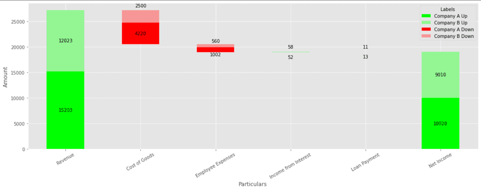
The stacked waterfall chart looks like:
Code
Let’s start by importing the required libraries:
import pandas as pd
import matplotlib.pyplot as plt

plt.style.use('ggplot')
Then, read the CSV file:
df = pd.read_csv('./Waterfall-Chart-Data.csv')Data for this illustration can be found here.
Like the previous illustration, we will be using matplotlib’s stacked bar chart.
For the above table data (used for rendering the stacked bar chart) would be:
{'_Base': [0, 20506, 18944, 18944, 19030, 0],
 'Company A Up': [15203, 0, 0, 52, 0, 10020],
 'Company B Up': [12023, 0, 0, 58, 0, 9010],
 'Company A Down': [0, -4220, -1002, 0, -13, 0],
 'Company B Down': [0, -2500, -560, 0, -11, 0]}
The function get_data returns this data dictionary.
def get_data(df):
    row_count = len(df.index)
    # Underscore is pre-pended to Base to ensure that it doesn't show up in the
    # lengend box
    data = {
        '_Base': [0] * row_count,
    }

    columns = df.columns[1: ]
    for change in ['Up', 'Down']:
        for column in columns:
            data[column + ' ' + change] = [0] * row_count

    for column in columns:
        for idx, value in enumerate(df[column]):
            if value >= 0:
                data[column + ' Up'][idx] = df.loc[idx, column]
            else:
                data[column + ' Down'][idx] = df.loc[idx, column]

    # calculate base
    prev = 0
    # Base for last will always be 0
    for i in range(row_count - 1):
        delta = 0
        cur = df.loc[i, columns].sum()
        if prev <= 0 and cur < 0:
            delta = cur
        elif prev < 0:
            delta = 0
        elif prev > 0 and cur < 0:
            delta = cur + prev
        else:
            delta = prev
        # ignore the calculation for first as it will always be 0
        data['_Base'][i] = 0 if i == 0 else data['_Base'][i - 1] + delta
        prev = cur
    return data
Finally, we will use the render_chart function to render the stacked bar chart.
def render_chart(data, df):
    # get the first column
    particular_names = df.iloc[:,0]
    X_AXIS = [particular for particular in particular_names]

    index = pd.Index(X_AXIS, name='Particulars')
    colors = ['#ffffff00', '#00ff00', '#93f693', '#ff0000', '#f79696']
    df_for_plotting = pd.DataFrame(data, index=index).abs()
    ax = df_for_plotting.plot(
        kind='bar',
        stacked=True,
        figsize=(15, 6),
        color=colors
    )
    ax.set_ylabel('Amount')

    row_count = len(X_AXIS)
    # ignore the base texts
    for p in ax.patches[row_count:]:
        width, height = p.get_width(), p.get_height()
        x, y = p.get_xy()
        if height:
            ax.text(
                x + width / 2,
                y + height / 2,
                int(height),
                horizontalalignment='center',
                verticalalignment='center',
                color='black',
            )

    plt.xticks(rotation=30)
    plt.legend(title='Labels', bbox_to_anchor=(1.0, 1), loc='best')
    plt.tight_layout()
    plt.show()
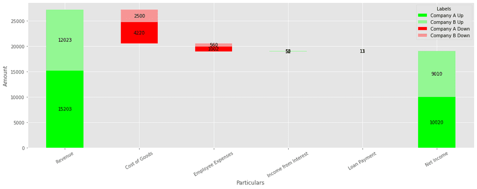
The rendered chart will look like this:
As we can observe, for smaller values the bar chart and the labels are overlapping (see Income from Interest and Loan Payment). Let’s fix this by positioning the labels above and below the bars for smaller values.
def render_chart(data, df):
    # get the first column
    particular_names = df.iloc[:,0]
    X_AXIS = [particular for particular in particular_names]

    index = pd.Index(X_AXIS, name='Particulars')
    colors = ['#ffffff00', '#00ff00', '#ff0000']
    df_for_plotting = pd.DataFrame(data, index=index).abs()
    ax = df_for_plotting.plot(
        kind='bar',
        stacked=True,
        figsize=(15, 6),
        color=colors
    )
    ax.set_ylabel('Amount')

    row_count = len(X_AXIS)
    y_min, y_max = ax.get_ylim()
    max_height = y_max - y_min
    height_limit = max_height * 0.1
    # ignore the base texts
    for p in ax.patches[row_count:]:
        width, height = p.get_width(), p.get_height()
        x, y = p.get_xy()
        if height:
            height_offset = 0
            if height < height_limit:
                height_offset = max(max_height / 30, height * 5 / 6)
            ax.text(
                x + width / 2,
                y + height / 2 + height_offset,
                int(height),
                horizontalalignment='center',
                verticalalignment='center',
                color='black',
            )

    plt.xticks(rotation=30)
    plt.legend(title='Labels', bbox_to_anchor=(1.0, 1), loc='best')
    plt.tight_layout()
    plt.show()
Let’s call the functions to render the chart:
data = get_data(df)
render_chart(data, df)
Full code can for this illustration can be found here.
Usage in Power BI
Power BI doesn’t offer a built-in chart for stacked waterfall chart. This method can be used in Power BI for rendering stacked waterfall chart using its ability to render Python visuals.


